Why colour matters now
Colour sets the tone before guests even hear the first note of music. It shapes the mood in photos, anchors your theme to the venue, and cues the pace of the day. Choose it well, and everything feels intentional—from your stationery and florals to lighting and late-night cocktails. Choose it carelessly, and things start fighting for attention. Moreover, thoughtful colour choices also help your suppliers move in the same direction, which saves time, reduces waste, and keeps the whole production coherent.
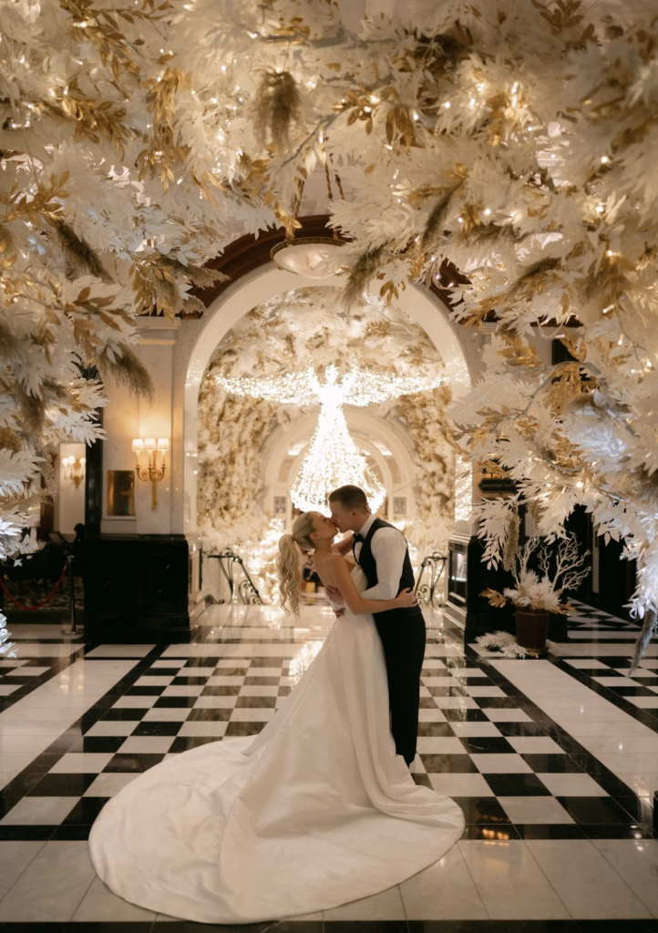
A strong palette behaves like a conductor—quietly guiding every element to play in harmony.
Start with your story (and your setting)
Rather than scrolling for trends until your thumbs ache, begin with what matters to you both. Your venue’s architecture, your wardrobes, the way you host friends at home—these clues build a palette that feels like you. Because when the hues match your personalities, the day reads beautifully on camera and in real life.
- Venue: read the floors, walls and ceilings. Heritage stone, dark timber or stark white render will warm up or cool down your colours.
- Season: spring pastels and fresh greens differ from winter’s richer tones and candlelit glow.
- Fashion: dress tone (cool ivory vs warm cream), suit fabric (black, midnight, or white), and jewellery metals all matter.
- Culture and heritage: include meaningful colours from family traditions, flags or ceremonial dress.
- Guest experience: consider visibility in low light, legibility of menus, and flattering tones for different skin tones.
Modern colour approaches & palettes
Monochrome with texture
Commit to one hue across the day, then build depth with materials. Think cloud-white aisle, porcelain chargers, alabaster vases and crisp linen—then add movement with frothy baby’s breath or sculptural orchids. The key: change scale and finish. Matte candles beside glossy lacquer. Soft chiffon next to polished marble. Photographs stay timeless, and the look feels calm, not cold.
Soft neutrals with a whisper of metallic
Stone, taupe and oat shades pair effortlessly with warm metallic notes. Choose brushed champagne over bright gold for a refined glow. Keep silver to cool spaces with concrete or white walls. Use metal sparingly—flatware, rimmed glassware, or foil on your menu—so it gleams, rather than glares.
Earthy Mediterranean: terracotta, olive, fig
Ground the palette with clay and olive, then lift it with creamy linen and hand-thrown ceramics. Add figs, rosemary and aged wood for scent and texture. Perfect for courtyard venues or sun-soaked estates, and just as striking in London warehouses when paired with limewash and warm lighting.
Sorbet pastels with gradient moments
Instead of a jumble of pastels, run colours in gentle gradients—blush to peach to soft apricot. Napkins in ombré, stationery with washed watercolour edges, and a cake that shifts shade by tier. It’s playful and modern, while staying grown-up.
Jewel tones after dark
Emerald, sapphire, amethyst—rich shades that love candlelight. Keep the ceremony lighter, then switch to velvet linens, dark florals and smoked glass for dinner. By the party, bring in coloured lighting on walls while keeping faces warm with amber on tables. Drama, handled with care.
Black, white and one accent
Ultra-chic and wonderfully clear. Use black chairs, crisp white linen, and one strong accent such as oxblood, cobalt or forest green. Repeat that accent three times—bouquet ribbon, bar front, and dancefloor graphic—so it feels intentional, not random.
Digital lavender and cool tones
A current favourite for fashion-forward couples. Pair soft lavender with steel, acrylic and mirrored finishes, then warm it slightly with mauve napkins or blush-toned candles. Keep florals architectural: anthurium, phalaenopsis, scabiosa. The result reads sleek rather than saccharine.
Coastal modern: sea glass, sand, slate
Think tidal layers—translucent blues, mineral greys, and soft sandy neutrals. Use rippled glassware, linen with a subtle weave, and brushed nickel accents. Avoid nautical clichés; this is coastal by texture and tone, not props and anchors.
Themes that feel current (without clichés)
Contemporary garden soirée
Bring the greenhouse indoors with living installations: potted trees, suspended meadow clouds, and mossed plinths. Keep the palette fresh—greens on greens with cream and a slice of citrus. Swap chair covers for sculptural seating, and use natural soundscapes during transitions for a seamless flow.
Urban gallery chic
Crisp white space, bold art moments and a strict palette. Commission an artist for a custom backdrop that later hangs at home. Serve small plates like an exhibition preview, with tasting cards that match your stationery. Lighting does the heavy lifting here: wash the walls, keep tables candlelit, and let the room glow.
Minimal ceremony, maximal party
Strip back the ceremony to clean lines, exquisite sound and a statement aisle. Then surprise guests at dinner with saturated colour, dynamic entertainment and lush texture. It’s the best of both worlds and keeps the day unfolding like chapters.
Destination weekend, one continuous story
Carry a thread of colour across three days. Welcome drinks in breezy neutrals, wedding day in your signature palette, and a cheeky pop of colour for the poolside recovery. Repeat motifs—tile patterns, monograms, fruit—so guests feel gently guided through the weekend.
Neo-classic manor glamour
Work with the architecture, not against it. Echo mouldings in your stationery borders, pick up stone tones in your linens, and amplify with crystal, marquetry and warm metallics. It feels grand without sliding into costume drama.
Colour psychology and the guest journey
Soft neutrals calm pre-ceremony nerves; greens feel fresh and life-giving; blues suggest trust and serenity; reds and magentas energise the dancefloor. Use this to pace the day. Keep the aisle soothing and bright. Then deepen shades for dinner when conversation settles. By the party, intensify colour with lighting on walls while maintaining flattering candlelight at face level. Guests feel the shift without quite noticing why.
Layering texture, material and light
Colour alone won’t carry the room. Texture and light are your best friends. Velvet absorbs light, satin bounces it, and crystal scatters it like confetti. Linen with a visible weave makes neutrals feel intentional, while lacquered elements add crisp edges. Then lighting finishes the job—soft amber on tables, cooler beams on architecture, and a subtle haze to make the room feel cinematic.
Florals and foliage that work hard
Choose flowers that suit the palette and the space. Tall ceilings love trees and towering branches; intimate rooms prefer lower arrangements so conversation flows. Seasonal blooms keep colours true and quality high. Reuse pieces—move the ceremony meadow to frame the band, repurpose aisle posies as cocktail clusters. It’s smart, beautiful and kinder to the planet.
Tablescape formulas that never fail
Reworking the 60-30-10 guideline
Pick a dominant tone (around sixty percent), a support colour (thirty), and a confident accent (ten). On a real table, that might be linen and chairs (dominant), florals and charger (support), and napkin or menu edge (accent). Keep metal finishes consistent across cutlery, candleholders and frames so the whole table reads as one thought.
- Start with linen swatches in daylight and candlelight—colours shift after sunset.
- Choose glassware tints with care; smoky or blush glass can subtly steer the palette.
- Use shaped menus or wax seals to add dimension without adding another colour.
- Cluster candles in mixed heights; it creates glow without visual clutter.
Dress code and fashion alignment
Your outfits anchor the palette. Cool ivory gowns pair better with silver or platinum; warm creams love champagne metals. For black tie, consider midnight blue for the groom—softer on camera than jet black. Share a brief dress code with guests (with examples) to avoid colour clashes. A simple line like “shades of forest, olive and cream encouraged” works wonders.
Stationery and digital touchpoints
The palette should whisper from your save-the-date to your thank-you note. Keep typography clean, repeat a motif, and use consistent paper textures. For modern sets, add a digital backdrop for your live band or LED screens that carry your colour story without screaming for attention. QR codes can sit neatly on escort cards if styled with the same fonts and hues.
Entertainment and production that match the mood
Brief your entertainment team on the palette early. Outfit musicians in complementary tones, dress the stage with the same florals and fabrics, and colour-grade screen content so it doesn’t fight your tablescape. Good sound and lighting teams are worth their weight in gold here—they’ll keep faces warm, photographs clean and the dancefloor irresistible.
Sustainability without losing polish
Hire, don’t hoard: quality linens, charger plates and statement pieces look better and generate less waste. Choose seasonal florals and foam-free mechanics. Donate arrangements after the event, and repurpose ceremony pieces for the reception. Small, thoughtful decisions add up to responsible luxury.
Budgeting for real impact
Spend where eyes linger: lighting, a statement installation, and beautiful linens. Keep favours useful or edible to avoid landfill. Ask suppliers for transparent pricing and a clear production schedule to avoid late fees. Reserve a contingency line for weather plans and extra power—less exciting than peonies, but far more useful at 11pm.
Common mistakes and quick fixes
- Too many colours fighting for attention. Fix: cap it at three main tones, then vary texture.
- Ignoring venue tones. Fix: sample colours on-site; absorb the floor and wall colours into your plan.
- Harsh lighting. Fix: amber on faces, colour on walls; not the other way round.
- Mixed metal finishes. Fix: pick one family (warm or cool) and stick to it.
- Chair chaos. Fix: the wrong chair can undo a perfect table—agree this early.
- Font overload. Fix: two typefaces max, used consistently.
- No plan for transitions. Fix: shift colour gently from day to night through lighting and linen swaps.
A sample colour plan for a city wedding
Ceremony in a white gallery, dinner in a candlelit ballroom, after-party in a chic club setting. The palette evolves through the day so each chapter feels fresh yet connected.
| Moment | Palette | Notes |
|---|---|---|
| Ceremony | Soft white, stone, fresh green | White aisle, alabaster urns, string quartet in cream tones |
| Cocktail | Oat, sage, citrus | Signature spritz with herb garnish, linen bar front with tonal monogram |
| Dinner | Champagne, taupe, caramel | Velvet runners, hundreds of candles, smoked glass charger |
| Party | Ink, sapphire, warm amber | LED wall content colour-matched to florals, mirrored DJ booth, warm face light |
Work with a creative partner
When your goal is a once-in-a-lifetime celebration, expert guidance saves time and raises the standard. Our luxury wedding planning team focuses on bespoke design, world-class entertainment and seamless delivery – always with clear communication and no surprises. If you’d like a colour consultation or a complete concept-to-party plan, we’ll shape your story into an event guests talk about for years. Contact our team to arrange a consultation.
Frequently Asked Questions About Styling The Modern Wedding
How many colours should we choose for a modern wedding?
Three main shades work well: a dominant base, a support tone and a confident accent. Add depth with texture—matte, glossy, sheer—rather than more colours.
Which colours are trending for 2025–2026?
Refined neutrals (stone, oat, champagne), soft lilac and digital lavender, warm browns (caramel to espresso), deep greens, and sharp cobalt accents. Metallics lean brushed and warm rather than high-shine yellow gold.
Can we use black at a wedding without it feeling harsh?
Absolutely. Pair black with crisp white and one accent, then warm everything with candlelight and natural textures. Keep faces lit in warm tones and place colour on walls or the bar for balance.
How do we change the palette from day to night smoothly?
Plan transition moments. Swap napkins or runners at cocktail hour, adjust lighting to deeper tones for dinner, and introduce bolder colour for the party through screens or scenic elements. Keep table light warm so people still look great in photos.
What’s the best place to invest for maximum visual impact?
Lighting first, then a statement installation (floral or scenic), and quality linens. These choices frame every photo and tie the room together far more than extra small decor items.