The Season’s Most Talked About Colour Palettes And How To Use Them
Trends in event design evolve constantly, and this season it’s all about striking the perfect balance between bold expression and soft sophistication. Whether you’re planning a romantic wedding, an upscale corporate gathering, or a playful summer party, your colour palette sets the tone before your guests even walk through the door. Here’s a look at the top colour palettes dominating the event scene this season, and how you can bring them to life in your next celebration.
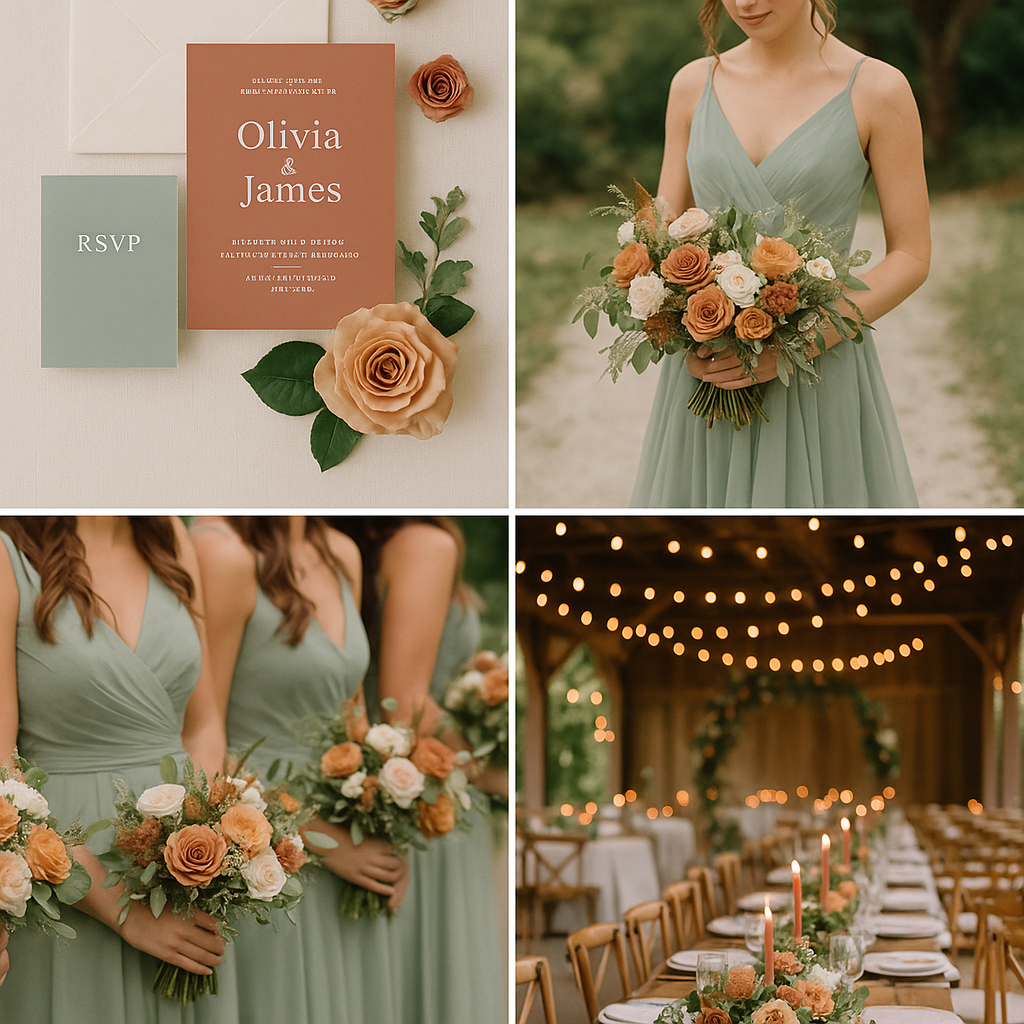
Soft Sage and Terracotta
This earthy duo has become a favourite for outdoor events and intimate weddings. Soft sage brings a calming tone, while terracotta adds warmth and depth. Together, they evoke nature, comfort, and effortless elegance. Think lush greenery offset by clay-hued details when paired with natural textures like linen or stoneware, makes this palette feel both grounded and chic.
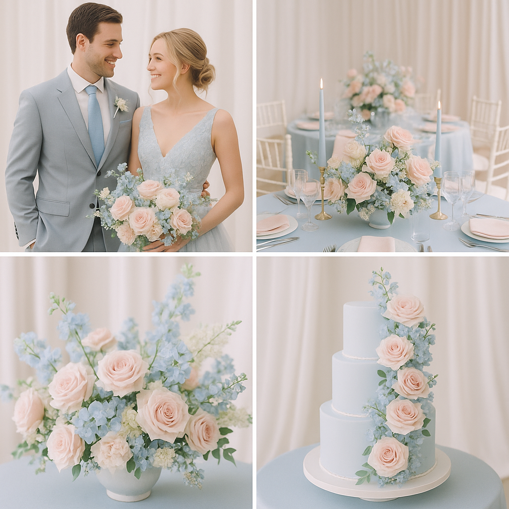
Pale Blue and Baby Pink
This soft, romantic palette is perfect for weddings, baby showers, and elegant spring events. Pale blue brings a sense of calm and freshness, while blush pink adds warmth and charm. Together, they create a dreamy, timeless look. Use pastel flowers, flowing fabrics, and subtle touches in your tableware or stationery. Pair with neutrals like ivory or grey for a polished finish that feels both delicate and modern.
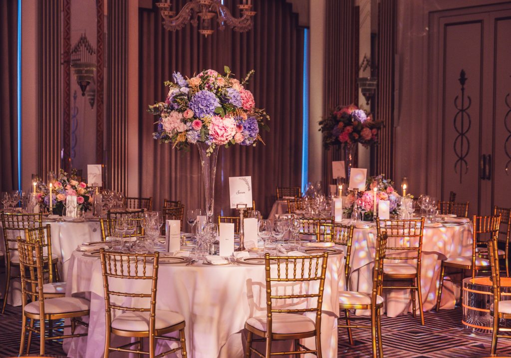
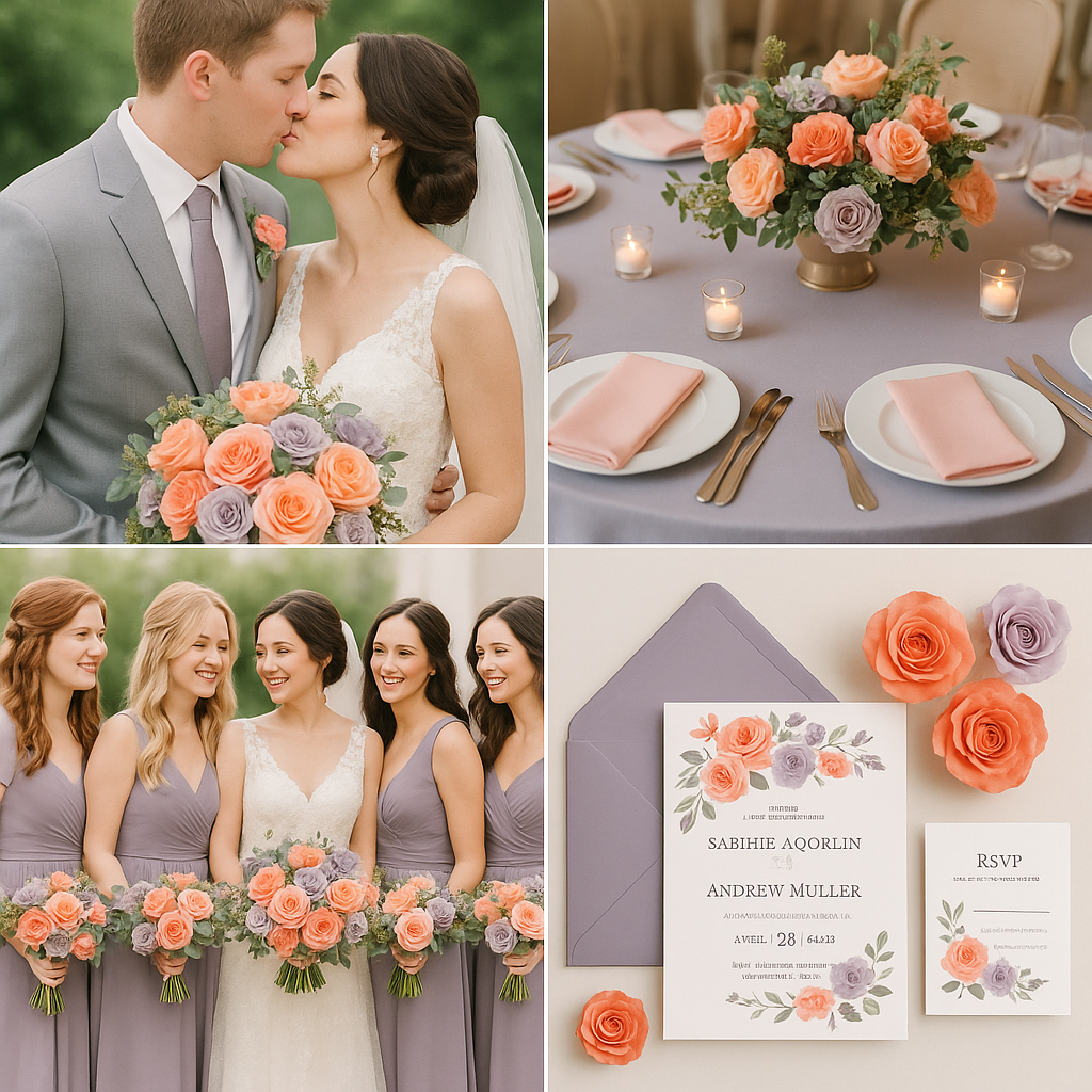
Coral Peach and Dusty Lavender
Coral peach adds a touch of sweetness and joy, while dusty lavender brings in a vintage softness. This palette is ideal for spring and summer weddings or garden parties where you want to lean into colour without overwhelming the senses. Floral arrangements using these tones feel fresh and feminine, and when paired with ombré backdrops or delicately tinted glassware, the entire event feels like a pastel dream.
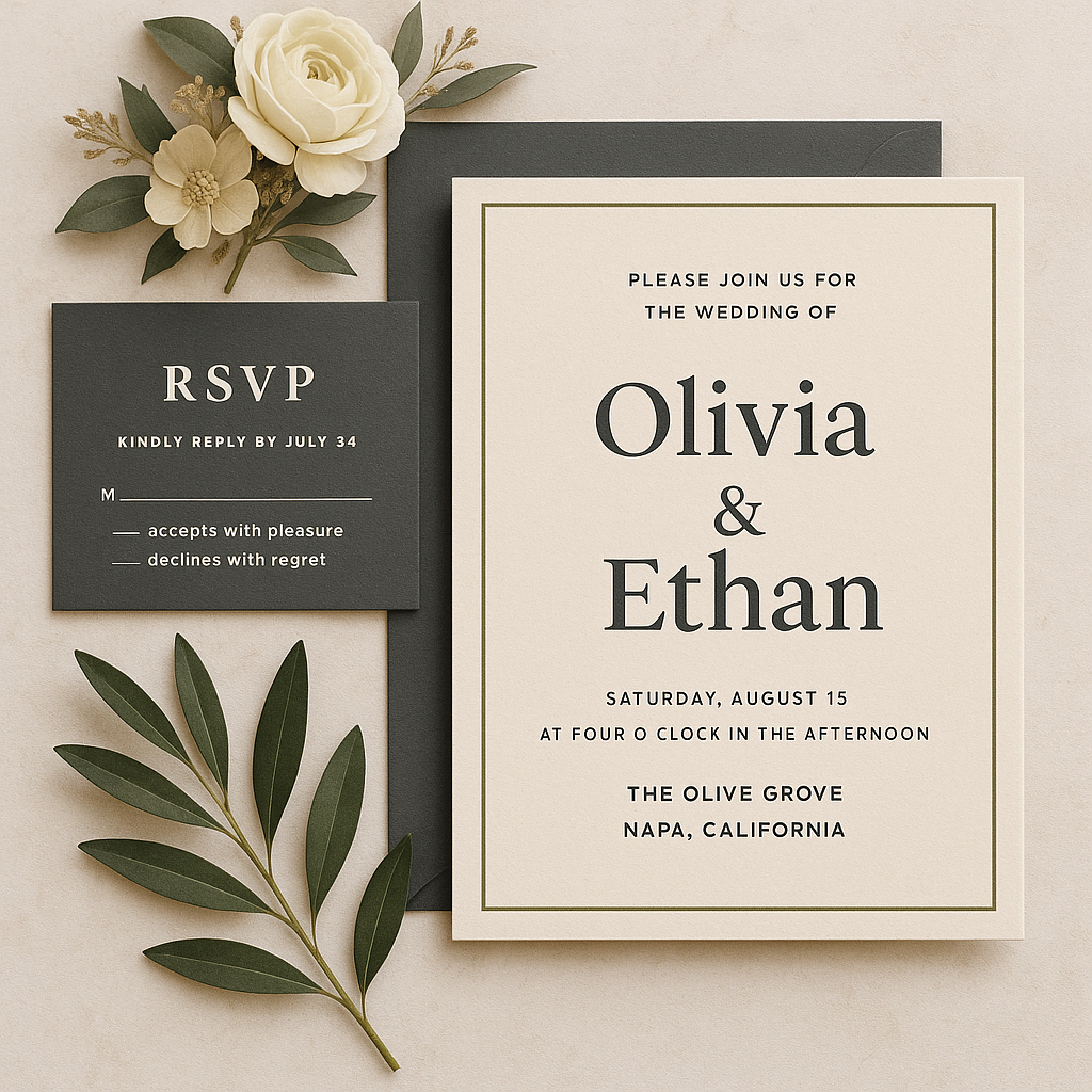
Charcoal, Olive and Cream
For a modern, understated vibe, this palette is both versatile and refined. Charcoal adds depth and grounding, olive brings a hint of organic sophistication and cream keeps the overall look clean and airy. This trio works especially well for corporate events, minimalist weddings, or brand activations that aim to be stylish without being flashy. Use these colours in your furniture, signage, and attire to create a cohesive atmosphere that feels intentional and elevated.
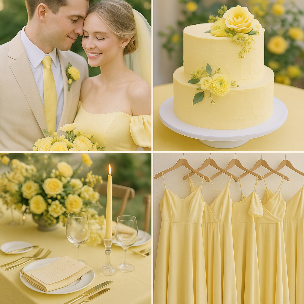
Butter Yellow
Soft, sunny and full of warmth, butter yellow is a cheerful yet sophisticated choice this season. It works beautifully for daytime weddings, garden parties, and spring or summer celebrations. This gentle shade adds a touch of optimism without overwhelming the design. Pair it with whites, soft greys, or even pale blue for a fresh and airy feel. Use it in florals, napkins, signage, or even a statement cake for a light, welcoming atmosphere.
Final Thoughts
While colour trends come and go, the best events use them with intention. Choose a palette that reflects the mood and purpose of your gathering and layer your design elements carefully to avoid visual overwhelm. Let colour tell your story from the moment the invitation arrives to the final toast of the night.
Need help bringing one of these palettes to life? Get in touch with our amazing team here at Cosmic Violet Events! We’d love to plan something beautiful with you!